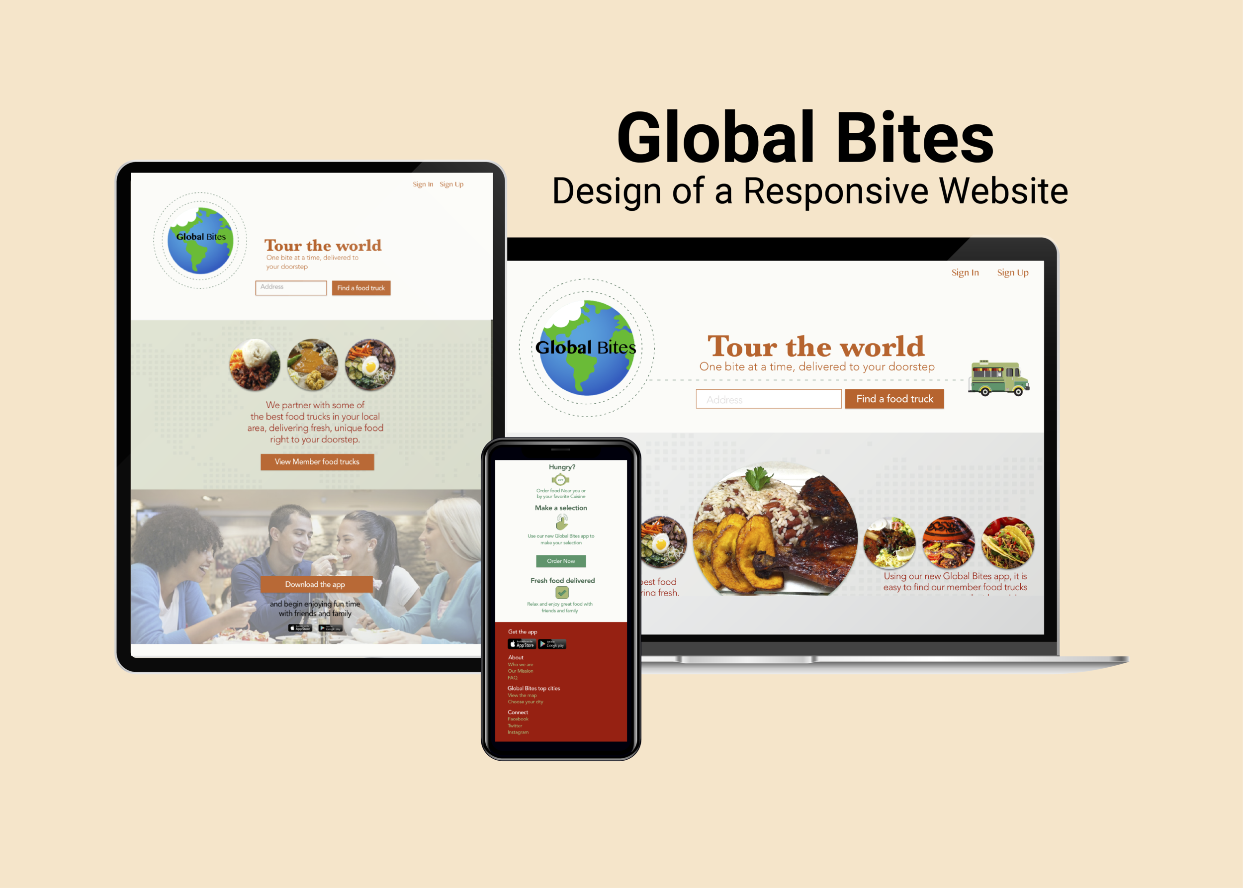
Goal: We wanted to make food ordering and delivery more convenient for our customers. We wanted to bring the food truck food they love to them, whether they were at work, school or home. Our secondary goal was to promote the new Global Bites food app for the iOS system.
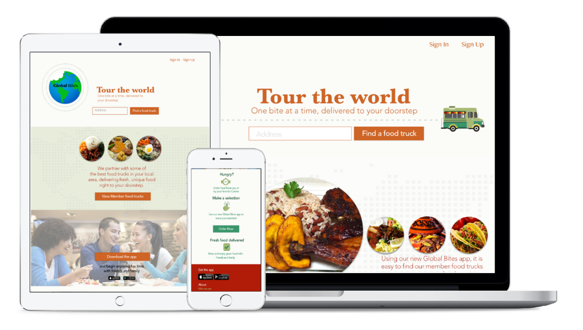
Challenge: The main challenge was to design and build a responsive website that would be accessible on all devices.
Solution: Provide clients with the opportunity to browse through different ethnic food options offered by food trucks that are part of the Global Bites group.

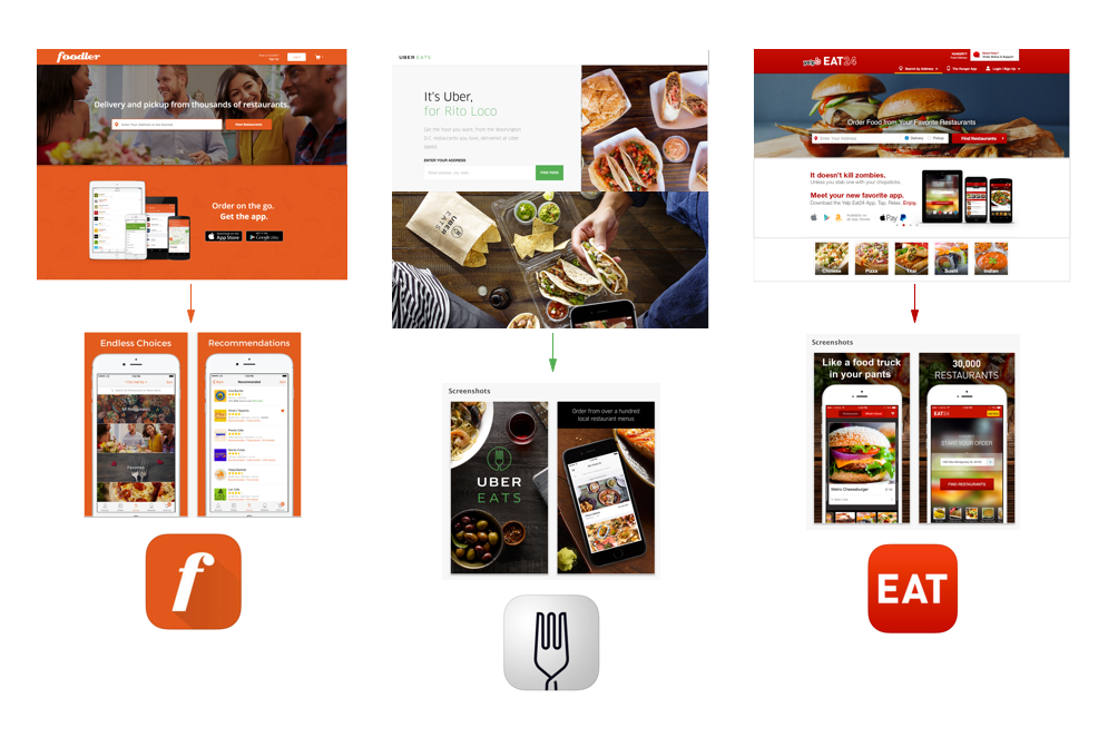
Competitive Analysis
Foodler | UberEATS | Eat24
Global Bites was unique in the sense that, it would be promoting member food trucks that had gone through rigorous tests to check for quality, cleanliness and great customer service. Secondly, we would deliver directly to the customer, avoiding third party companies that would undermine the speed and quality of the food. Three food delivery and pickup services were compared, namely, Foodler, UberEATS and Eat24. They focused on showcasing their benefits of using their service and most importantly ease of use of their app on multiple devices. We wanted to differentiate ourselves by our global reach and the use of our app.
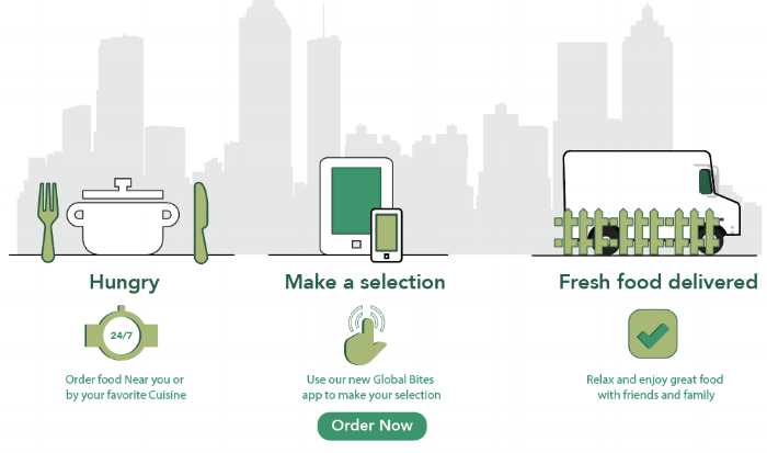
How did we differentiate ourselves you ask? Our logo immediately suggests that our users will have the opportunity to travel to every part of the globe by ordering from our food trucks. Secondly we incorporated an illustration of a food truck that not only looks cute, but also suggests the delivery of food to your premises. Call to action links are strategically located for easy access. Lastly we created an infographic that appeals to the user visually and lists the steps in a very simple step process. The picket fence and cityscape symbolizes the delivery of food to any location, be it your office or your home.

Layout & Visual
Mockups | Typography | Logo
A great dining experience with friends and family with great food is the focus of my design. Using the competitive analysis results above, the key was to keep a consistent look across applications, keeping the design and color palette simple yet pleasing to the eye. Images of fresh, quality food are center stage and consist of food that is found around the world. Call to action button links are positioned strategically and move the user to either find member food trucks, order food or download the free iOS app.
Keeping a consistent color palette was key to the success of the overall user experience. As seen below I wanted to bring in the blackboard background used on the mobile screens to create a seamless transition, however, this brought down the lightness of the page and I opted for lighter backgrounds. The image of the mobile food truck was used to depict the flavors and ethnic cuisines that can be sampled from around the globe and delivered to your doorstep.
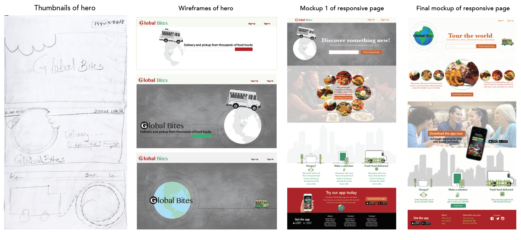
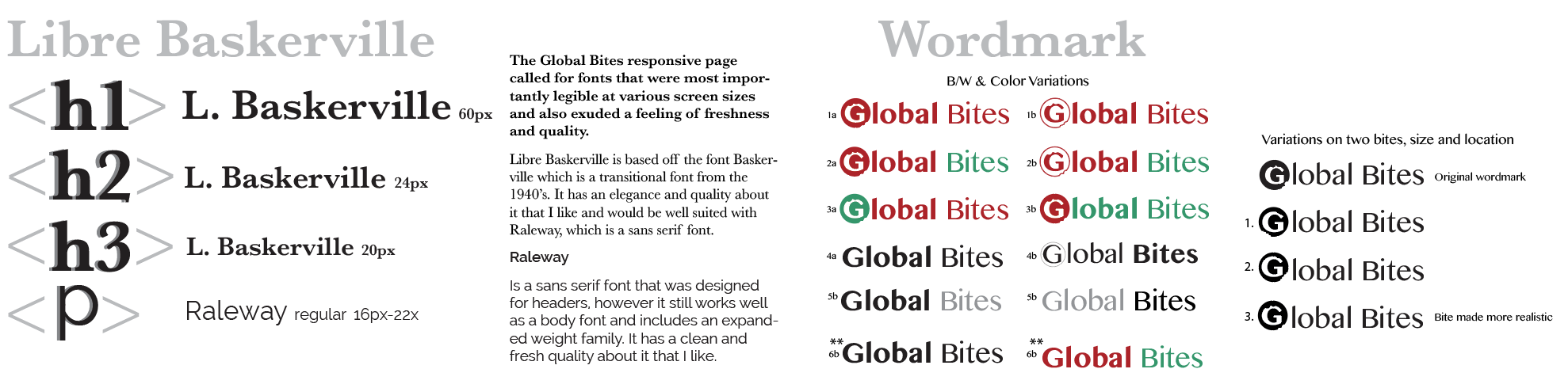
The typeface chosen for the page was Libre Baskerville for the headers and Raleway for the body text. In the case of the wordmark the Sinhala MN typeface was used. The wordmark went through numerous changes with the addition of the bite mark and its location. Feedback was received and #6 was chosen as the most successful, especially when viewed on a small screen. The responsive page utilizes the black and white version that contrasts well with the blue and green globe.
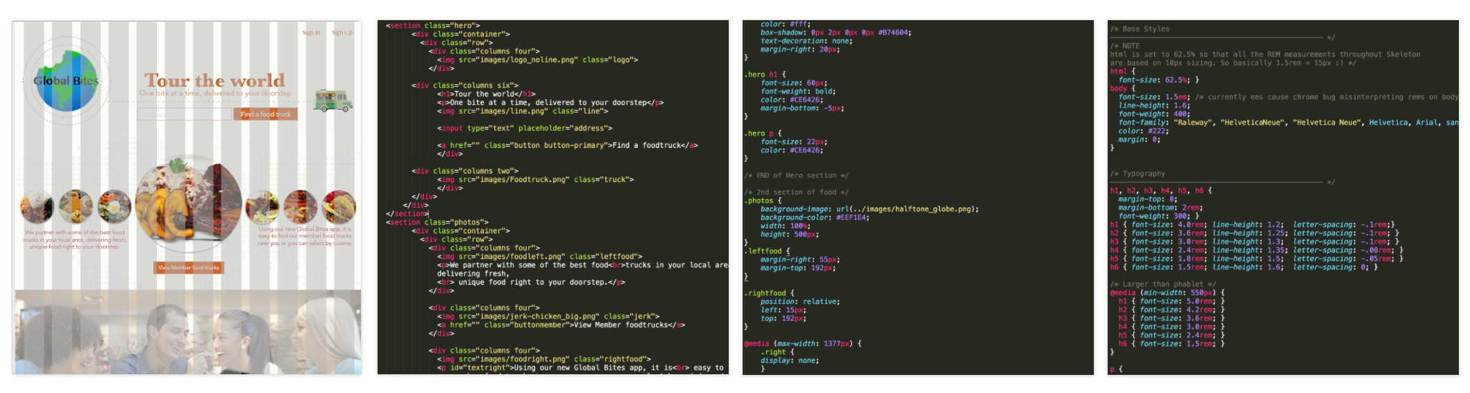
Creating the responsive page, entailed extracting and exporting the images designed in Sketch to be included in the code. The Skeleton framework (as seen on the bottom right) was used as a starting point to code the page. As seen on the bottom left, a 12-column fluid grid is utilized and would shrink with the browser/device at smaller sizes. Media queries have been used and are set as mobile-first with the target of min-width.

Conclusion
Final thoughts