
Global Bites Food Truck App Case Study
Project: Wireframe and Design a Mobile App
Target User: Food Lovers
Goal: Create a Food Truck App That Let’s Users Select, View and Order Food
Role: UX, Visual Design and Branding
Goal: Global Bites is a food truck app that lets you order food from your favorite food trucks, right to your doorstep. Their main focus is on providing healthy, clean, and tasty food from around the globe.
Challenge: The main challenge was to design a mobile iOS application that allows consumers to find food trucks near them, view a menu, select items for purchase, and checkout. Users can also view their previous transactions, and provide feedback for each food truck they've purchased from. A secondary challenge that was received from the surveys was that consumers were concerned with food safety.
Solution: Clients want food from vendors they can trust. I focused on creating a clean, ingredient focused design, that was both intuitive and easy to use.

User Research
Surveys | Personas | User stories
The food truck industry continues to grow at a steady pace. Consumers are becoming more adventurous and love the variety and the ability to order food at the touch of an app.
A survey was sent out and we concluded...
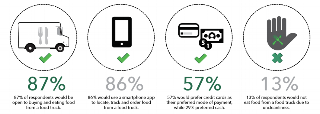
We interviewed ten people through e-mail surveys and face to face interviews. From our results, we can conclude that our food lovers are willing to buy food from food trucks and want a convenient way to do so. The app should be simple, easy to use and focus on the ingredients to show freshness and quality.
Who are our respondents you ask?
Edwin M
Age: 40
Occupation: financial analyst
Location: Atlanta, GA
Tier: professional
Status: married with two kids

“A food app that is easy to use, lets me view my recent transactions and pay using my credit card on file is most important to me.”
Likes: During the summer, Edwin and his family attend food truck festivals in downtown Atlanta. He is always on the look out for good food trucks that serve a fusion of fresh Italian and American dishes. Customers always come back for two things, great food and outstanding customer service.
Dislikes: Bad customer service is his number one pet peeve. Having grown up in the restaurant business he has learnt what it took to grow a loyal customer base. He believes in going above and beyond for your customers.

Susan O
Age: 47
Occupation: educator
Location: Tuscon, AZ
Tier: professional
Status: married with two kids
“An app that is easy to use and allows me to view a detailed menu while being able to rate and review food trucks is most beneficial to me.”
Likes: Susan appreciates good food. She has not quite gotten in the food truck craze, but her teenage kids have convinced her to try out a number in Tucson. She loves to snack and finds that buying finger food from food trucks she has done research on is quite a great weekend activity. Her family has varied tastes. She likes more ethnic foods, specifically Mediterranean.
Dislikes: Susan’s hesitation with food trucks have been substandard levels of cleanliness. Not having enough room for cleaning and being a mobile unit, in her opinion, has made her reluctant to try them out in the past. She does however, value family time and uses yelp reviews to assist her in selecting food trucks that serve fresh, quality food under very sanitary conditions.
From our research, we can conclude that both our users like simplicity, in regards to the ease of use of a food app and that they hold food in high regard. What does this mean for the UX designer? We will focus on creating a user experience that is simple and focuses on the ingredients to show freshness and quality.

Structure & Layout
User flows | Wireframes | Mockups
User flows show the journey users will travel through any system to complete a given task
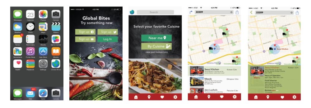
In this case a first time user will click on the Global Bites food truck app on the iOS home screen and then sign up with either their Facebook, or Twitter accounts on the welcome screen. Users also have the choice of creating a new account using their e-mail address. Once signed up a user will then navigate to find a food truck either near them or by choose by cuisine. In this case we have selected the, "near me", option, and selected the Seoul Kitchen food truck.
The next screen provides the user with a brief overview of the food truck's food selection and hours of operation. A user is able to click on a, "menu" that takes them to a full menu. When items are selected a user can opt for either paying in cash or credit. Users are also given the option to rate and review their experience.
A returning user will click on the Global Bites food truck app on the iOS screen and log in on the welcome screen. In this flow a returning user will have the opportunity to view previous transactions as well as rate and review their experiences.

Low and high fidelity wireframes were utilized to define and demonstrate both the hierarchy and functionality of the steps the user will take in order to complete their transaction. A first time user will have the opportunity to save their credit card for future transactions when they set up an account. A return user will have access to their previous transactions.
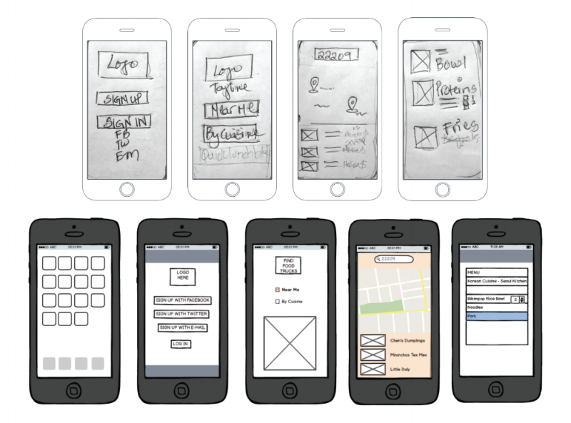
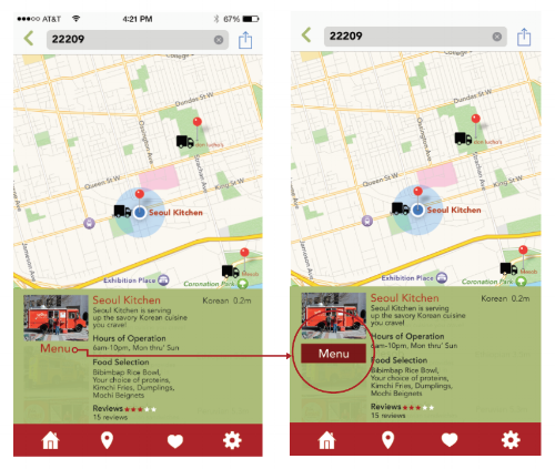
High fidelity mockups bring designs to life. Color and typography come to life to create a final static representation of what the interface will look like. It is always a good idea to test often, therefore, I tested the first five screens at usabilitytesting.com and found the user was not sure of their way forward. The "Menu" link on the last screen was not emphasized.
Usability Testing
Usability testing is very beneficial in the design stage. Wireframes and prototypes can be tested to ensure that the navigation in place is easy to use and presents a clear path for the user. As seen below, the left screen's "menu" does not pop and therefore gets lost, users are not sure whether it is a link or part of the text. On the right screen, "Menu" has been made the focus of the screen, by adding a red link box and therefore stands out as a clickable link that would take users to the next screen to view food items. Usertesting.com was used to test the first 5 screens. As a new or return user I wanted to find out their journey and if they were successful in navigating to the menu of their selected food truck. From the link below, the tester was able to navigate through the screens and liked that each featured food truck had a list of food items on its preview screen, before clicking to the screen with the full menu. The user was not able to view the menu, in part because the word, "menu" was not emphasized and did not resemble a link. As seen below the prototypes are revised and the link made more visible.
“ITS ALL ABOUT THE USER. From our personas’s above they mentioned key elements that were important to them. A simple interface, Viewing past transactions, Paying with a credit card on file and lastly Rating and Reviewing food trucks.”

Visual
Color | Typography | Logo
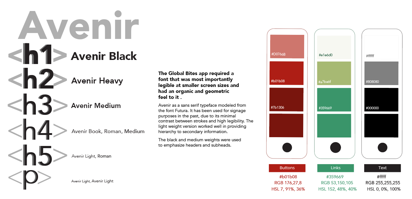
A contrasting color palette was chosen made up of greens and reds. Warm colors tend to evoke the feelings of warmth and are used a lot in the food industry. The typefaces chosen were simple and legible on small screens. To simplify things even further, only one typeface was chosen. Avenir is a sans serif typeface that has multiple variations within its family and works well on small screens.
The brand identity for the Global Bites app went through a rigourous design process. There are many food truck apps in the market and most of them have an icon that is symbolic to the industry. This translated to a lack of creativity, therefore my task was to design a logo that was unique and easily recognizable. I played off the title and the global perspective to create a unique logo.
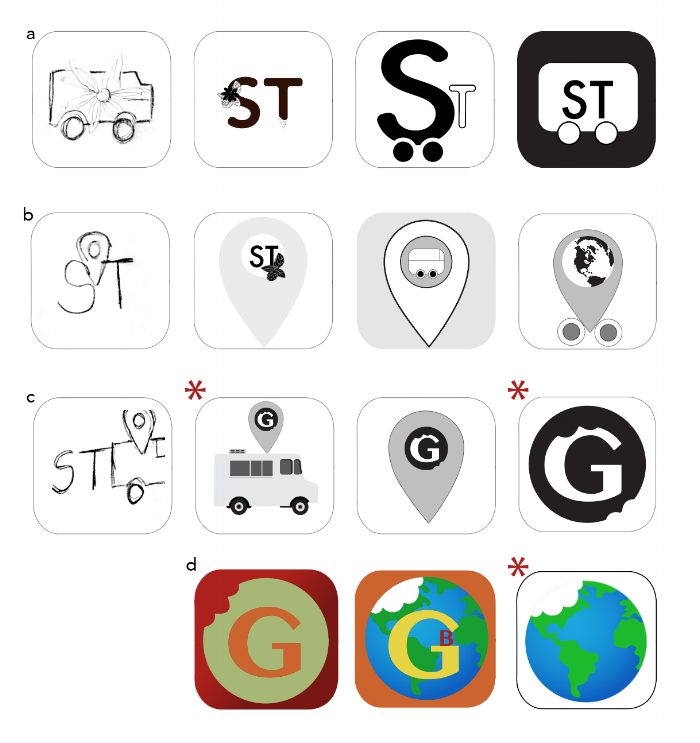
a. Spice Trackers was my initial brand name, however the name did not represent food from the whole world. Global Bites was used instead and does a better job in representing the meaning of the brand. In my first set of sketches, I wanted to incorporate the use of spices that are used a lot in international cuisines. In this case the use of basil, anise and jalapeno's were used. The mobile factor was also brought into play.
b.The icon of a tracker was used to suggest the ability of users being able to track food trucks by location or by cuisine. The mobility factor was also brought into play and suggests the varied cuisines that users have access to.
c. The tracking concept was pushed further by using the first letter of the brand and playing off the second word by incorporating a, "bite" off the G. Numerous versions of the bites were done to create a realistic look. A question arose as to why there should be bite marks on both the letter and the globe.
d. I experimented further with the one bite concept and preferred a single bite on the left side of the globe. Color was then introduced taking it as far as using the colors of the actual globe. Eliminating the acronym/s creates just enough tension and curiosity for potential users, while giving enough information for them to know what it is.

Conclusion
Final thoughts
