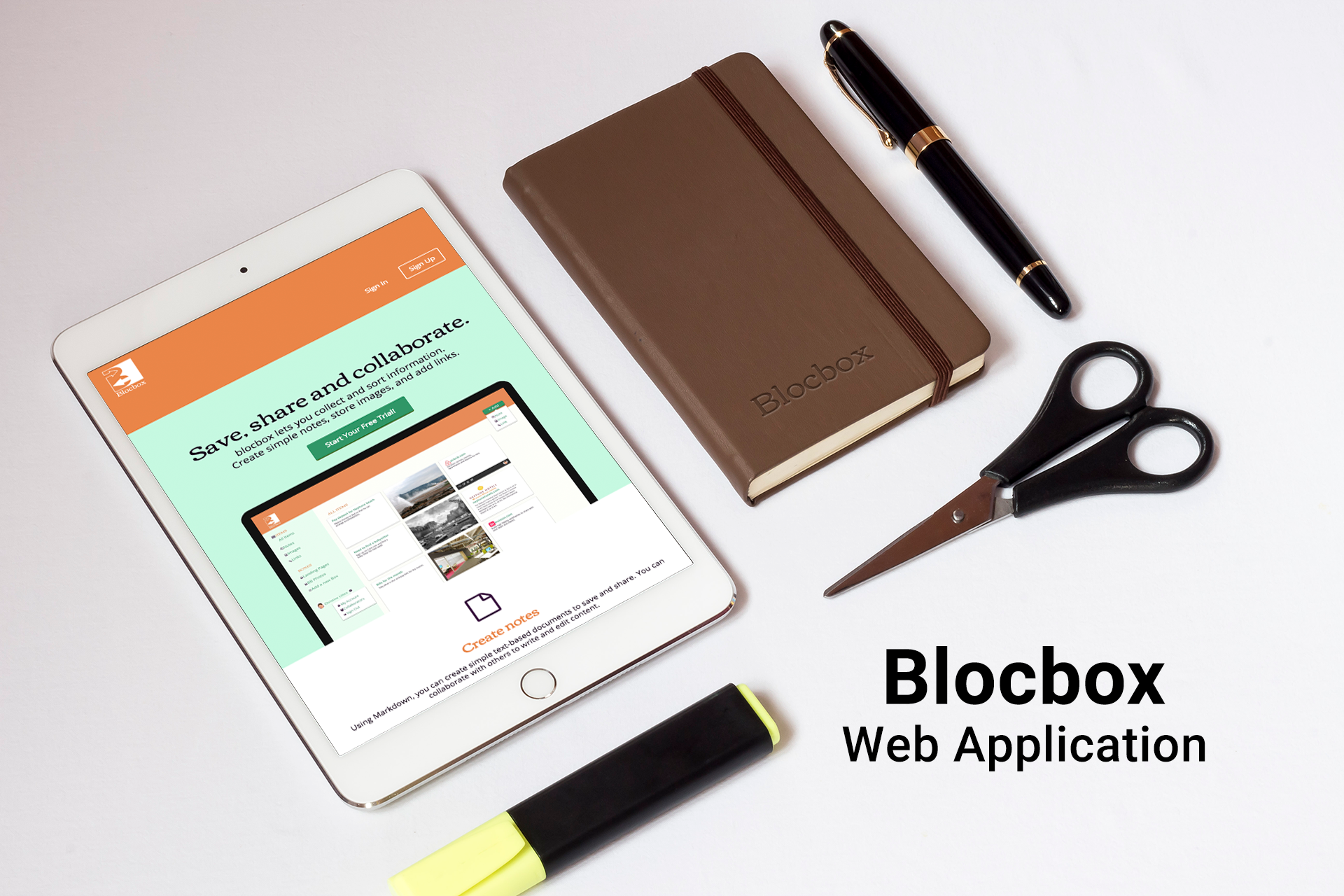
Blocbox Web Application Case Study
Project: Wireframe and Design a SaaS Web Application
Target User: Food Lovers
Goal: Allow users to collect information and store it in a single place. Users can also create simple documents, store images, links to websites, and collaborate with others.
Role: Branding. Collaborated with a UX professional on the UX and Coding of the project.

Goal: Blocbox allows users to collect information and store it in a single place. Users can also create simple documents, store images, links to websites, and collaborate with others.
Challenge: The main challenge was to design a SaaS Web Application that allows users to create notes, save images and add links. Users would also be able to collaborate with other users by sharing their favorite images and links.
Solution: Create a simple interface to create and save notes, links and images, while making it responsive and viewable on any device.

User Research
Surveys | Personas | User stories
Having access to your information at all times is very important to users. Users want to share and collaborate with team members and friends while using their devices.
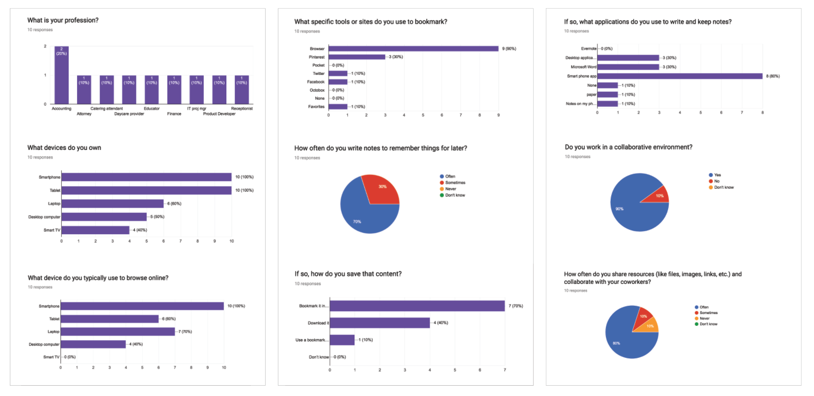
A user survey was sent out to 10 professionals in various fields via e-mail and followed up a couple of them with face to face interviews. The survey asked important questions that asked users how they save information they find online, if they work in a collaborative environment and what they use to register for a new account. The results came in and we concluded...
100% of users own both a smart phone and tablet
100% of users use a smart phone to browse for content online, while 70% use a laptop
70% bookmark content they find online, however, the disadvantage to this system would be content that may no longer be available or is easy to forget whats been bookmarked
70% of users mentioned that they would often write notes of a personal nature, and would use their smart phones to write and keep notes. The advantage would be the ease of use and quick access to notes. The only disadvantage would be if phones are misplaced and information has not been backed up.
90% of users mentioned they work in a collaborative environment, and that 80% said they often share information with colleagues and friends
It was interesting to note that even though 70% had a Facebook or Twitter account, only 30% mentioned that they would register or sign up for an account on websites
Who are our respondents you ask?
Joseph J
Age: 45
Occupation: product designer
Location: Silver Spring, MD
Tier: professional
Status: married with one kid

“I share information with my team. I would like an application that can easily track my progress, and be accessible on all my devices.”
Likes: Joseph works with quite a number of images some of which he will save to named folders on his desktop both at work and at home. He works a lot with his team, sharing information and collaborating on projects. He likes to use project management tracking software, that enables him to share files, set benchmarks, leave comments and track general progress. He would like to be able to sync to all of his devices.
Dislikes: A cluttered desktop has become the norm and keeping track of images in folders has becoming an issue. Not having access to his images, links and notes when he travels is a great disadvantage.

Patricia M
Age: 50
Occupation: accountant
Location: North Plainfield, NJ
Tier: professional
Status: married with two kids
“I would like an application that is easy to use and very organized. It should be a hub where I can store and share all my images, notes and links.”
Likes: Patricia commutes an hour and a half by train to New York. She uses her phone while commuting, sharing photos on social media of her recent travels. She does like things very organized and does not mind having different apps for different things. Images she finds on the internet while on her phone are saved in her photo gallery or sent as links to her e-mail. She uses her note taking app on her phone for things she has to remember such as shopping lists or appointments.
Dislikes: Not being able to keep track of her notes, especially if they are time sensitive. Losing her phone would be a great disadvantage.
From our research, we can conclude that both our users collect and share information and would like a central location that will allow them to store their notes, images and links.

Structure & Layout
User flows | Wireframes | Mockups
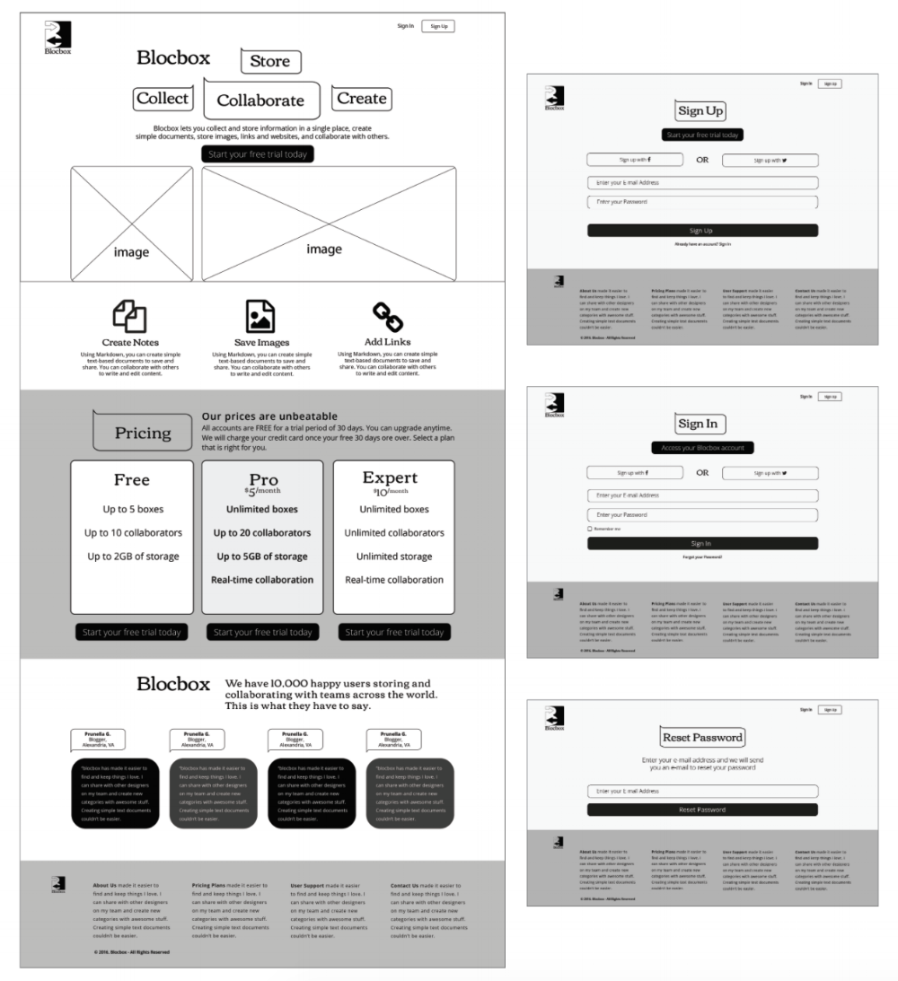
There are two user groups. The first time user, and the returning user. These two groups have shared tasks, that we will detail below. As a first time user visiting Blocbox they will want to sign up by creating an account and have the option of either using their e-mail or using their social logins. The dashboard provides all the information and services available including pricing if users want to upgrade. There are also testimonials about the application and its benefits. As a returning user they can sign in using any of the three options below including their email and password. They also have the option to reset their password, with a password reset message sent to their email. Once logged in, a returning user will have access to the dashboard where they can access their saved images or add new ones.

Shared tasks include creating a new box and adding a link, image or note. Both users can upgrade their account by accessing the account settings icon and selecting a payment plan that suits their needs. Simplicity and design of the interface is of major importance, therefore we can focus on building a Minimum Viable Product by only offering the most important features. Secondary features can be added on a later version. Adding and managing collaborators could be one of those features.
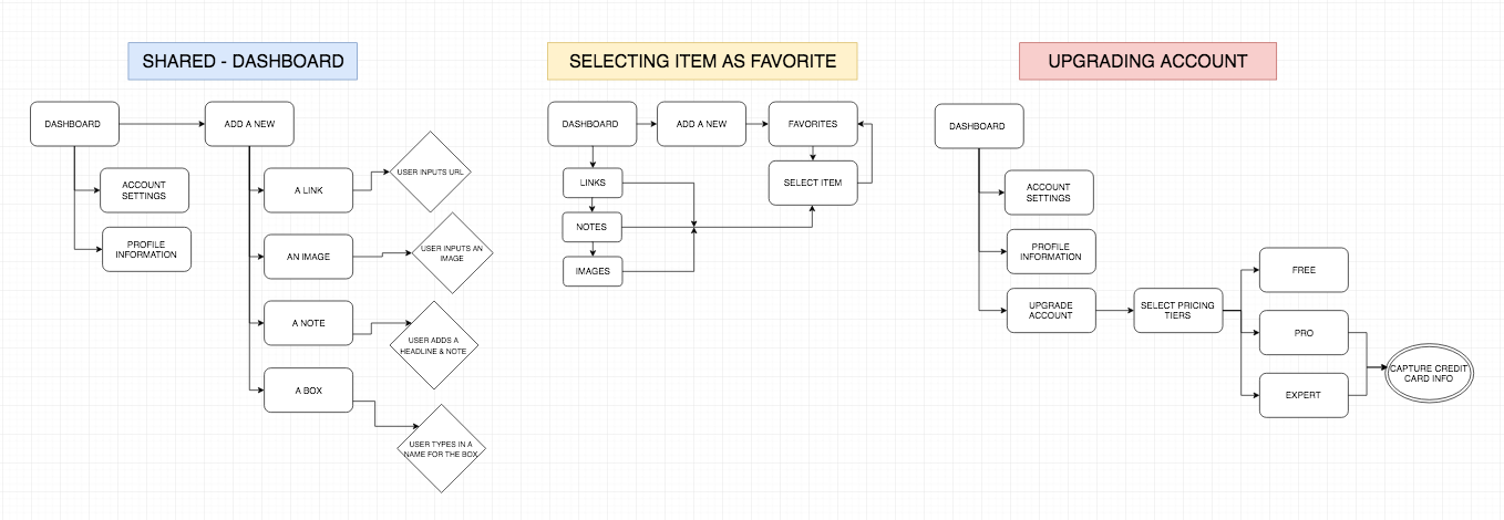
A sitemap was used to determine the number of pages, navigation structure and hierarchy of the site application. Emphasis was placed on providing clear navigation and an understandable site structure within blocbox.

On-boarding Process
To keep the users engaged, a simple on-boarding process was implemented. We tested our on-boarding process and it was clear that the goal of the web application clearly states the intent and the call to action links are highly visible and centrally located for easy view. We want to keep the registration process simple for both new and returning users, so as to keep users engaged and allow them to quickly start using the features of Blocbox. A great on-boarding experience can result in more user interaction and lower drop-off rates when signing up. Social authentication, using Facebook or Twitter, is important for return users as this allows them to sign in without having to remember a password.
The Coding process
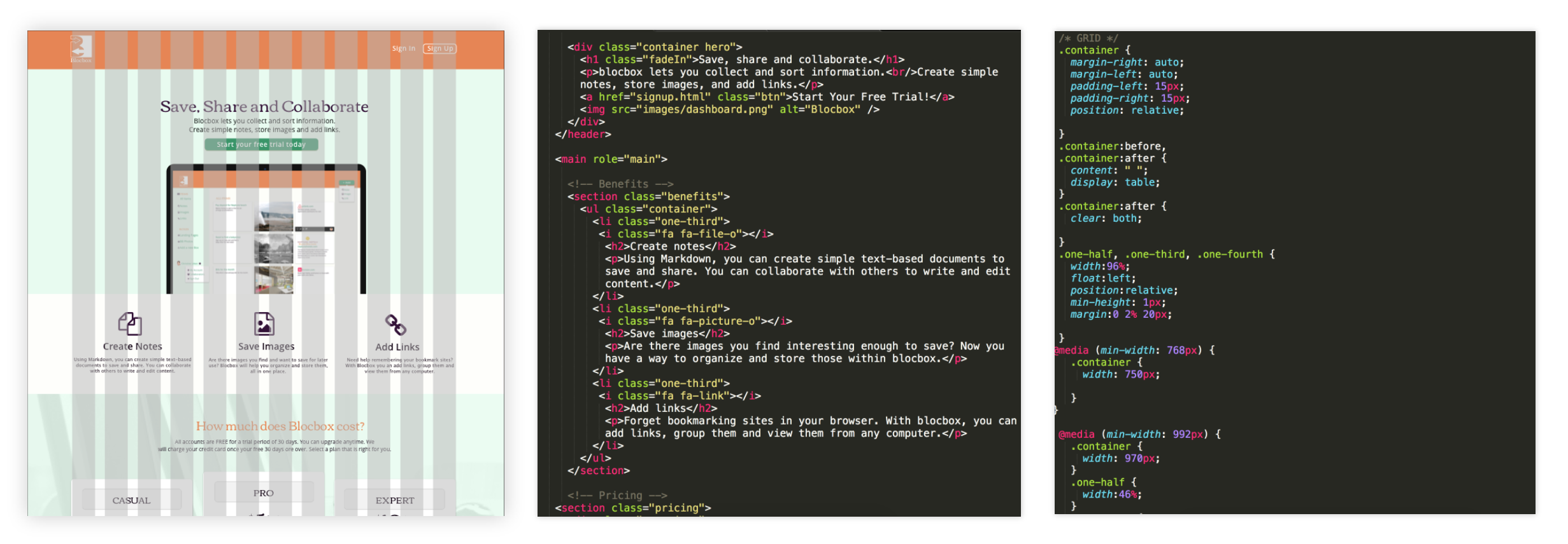
The next stage was to code the web application using HTML5, CSS3 and Javascript. Favicons were used from font Awesome that included the necessary code to display the icons appropriately. Examples include the notes, images, links and social media icons. Use of a grid was used as seen on the bottom left for organization and coding purposes. Javascript was used in the add button on the main dashboard as a dropdown feature that incorporates users being able to add notes, images or links. A second drop down feature was added at the bottom left of the same page and includes my account, collaborators and the sign out option.

Visual
Color | Typography | Logo
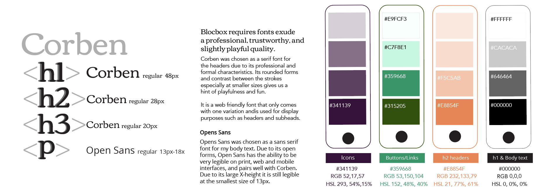
The brand identity for Blocbox went through the whole design process, with multiple sketches and refined mock-ups. There are many food truck apps in the market and most of them have an icon that is symbolic to the industry. My task was to design a logo that was unique and easily recognizable. I played off the title and the global concept to create a unique logo.
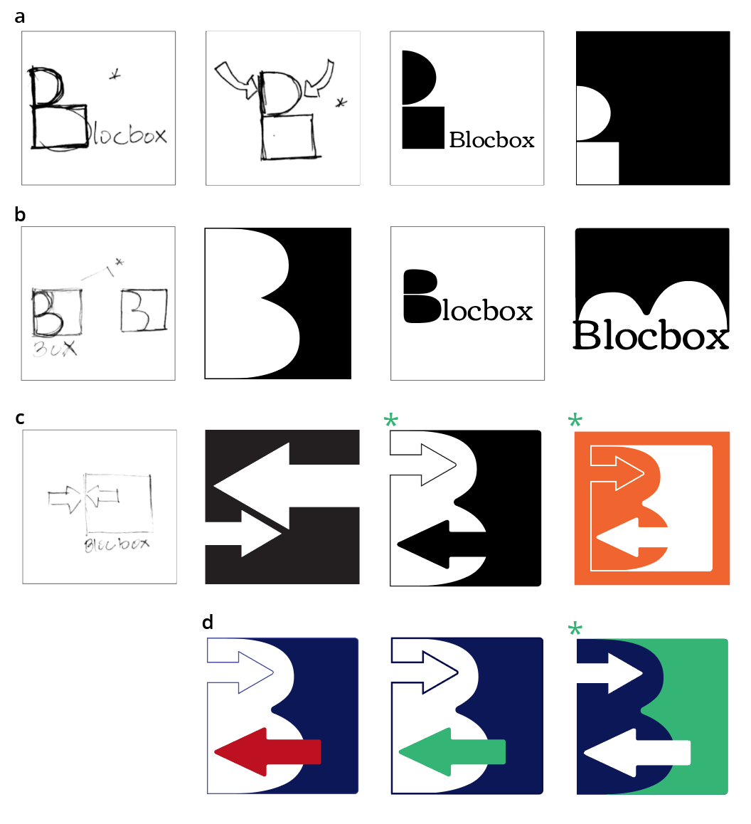
a: The B is transformed into geometric shapes and acts as a focal point. In this case the lower counter would play off the idea of a box. Experimenting further with figure ground reversal and placement of the shapes to create tension.
b: Similar concept of utilizing the B enclosed in a box to create interesting negative shapes. Taking this further with orientation and using the actual counters creating organic forms.
c: I used the concept of arrows to indicate the adding or collecting of information. The connecting arrows also imply the collaboration of members. The box again plays off the name, but also all the services that can be performed in one location.
d: An analogous color palette of green and navy blue was selected to create a feeling of harmony. The arrows become the focal point, and translate to the sharing and collecting of information. I chose a white version of the logo to blend well with the dark background of the website.

Conclusion
Final thoughts
